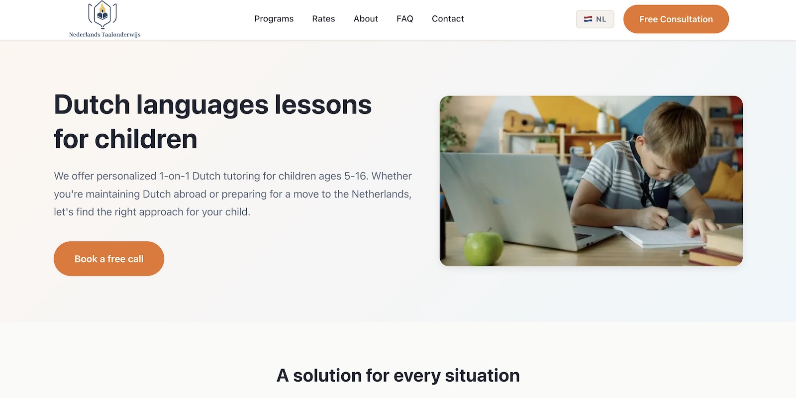
Dutch Language Learning
Tech Stack
React Storybook Tailwind CSS Figma
Dutch design system and component library for consistent brand experiences
Overview
A comprehensive design system inspired by Dutch design principles — clean, functional, and accessible.
Challenge
Teams across multiple projects were inconsistently implementing UI components, leading to fragmented user experiences.
Solution
Created a shared component library with Storybook documentation, design tokens, and Figma integration to ensure visual consistency.
Results
- 30+ reusable components
- Adopted across 3 internal projects
- 40% reduction in UI development time
Tech Deep Dive
- React component library with TypeScript
- Storybook for interactive documentation
- Tailwind CSS for utility-first styling with design tokens
- Figma plugin for design-to-code sync